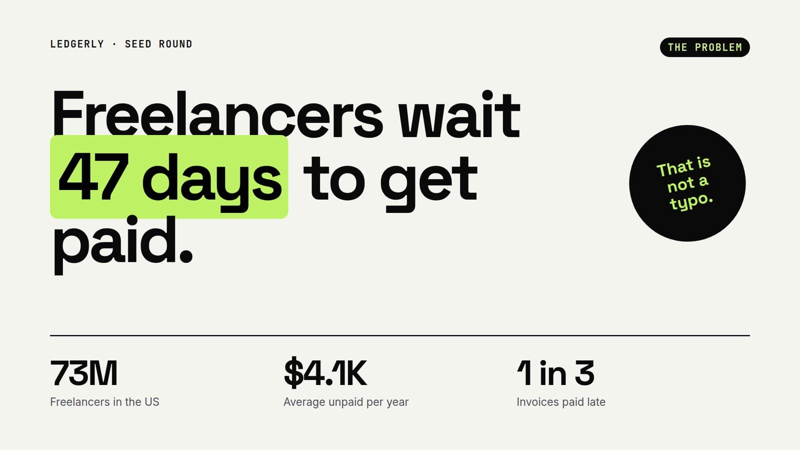
Presenting numbers people remember
One number per slide, a clear comparison, and a sentence that says what it means. A simple system for data slides that land.

Data slides fail in a predictable way. Someone pastes a table, shrinks the font until it fits, and asks the audience to find the point. The audience reads the table instead of listening, and the point never lands.
Lead with the takeaway
Write the headline as the conclusion, not the topic. Revenue by quarter is a topic. Revenue doubled in two quarters is a takeaway. The chart then becomes evidence for a claim the audience already understands.
Match the number to the shape
- One big figure: use a stat hero. Let it fill the slide.
- Three or four headline metrics: use a KPI row so they read as a set.
- Change over time: use a line or bar chart with few labels.
- Parts of a whole: use a donut, and only with a handful of slices.
ViziSlides reads this shape for you. Write metrics as a label and a value, such as Retention: 92%, and the layout engine picks stat cards. Give it a series, such as Q1: 1.2M, Q2: 1.8M, and it builds a chart.
A number without a comparison is trivia. A number with one is an argument.
Never invent the figure
Your credibility rests on your numbers. ViziSlides only places figures that appear in your prompt or source material. If you want a statistic on a slide, include it, ideally with its source.